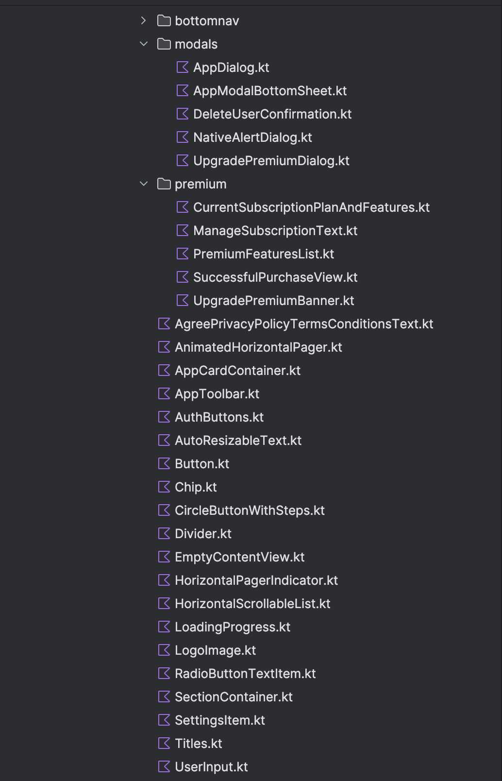
UI Components
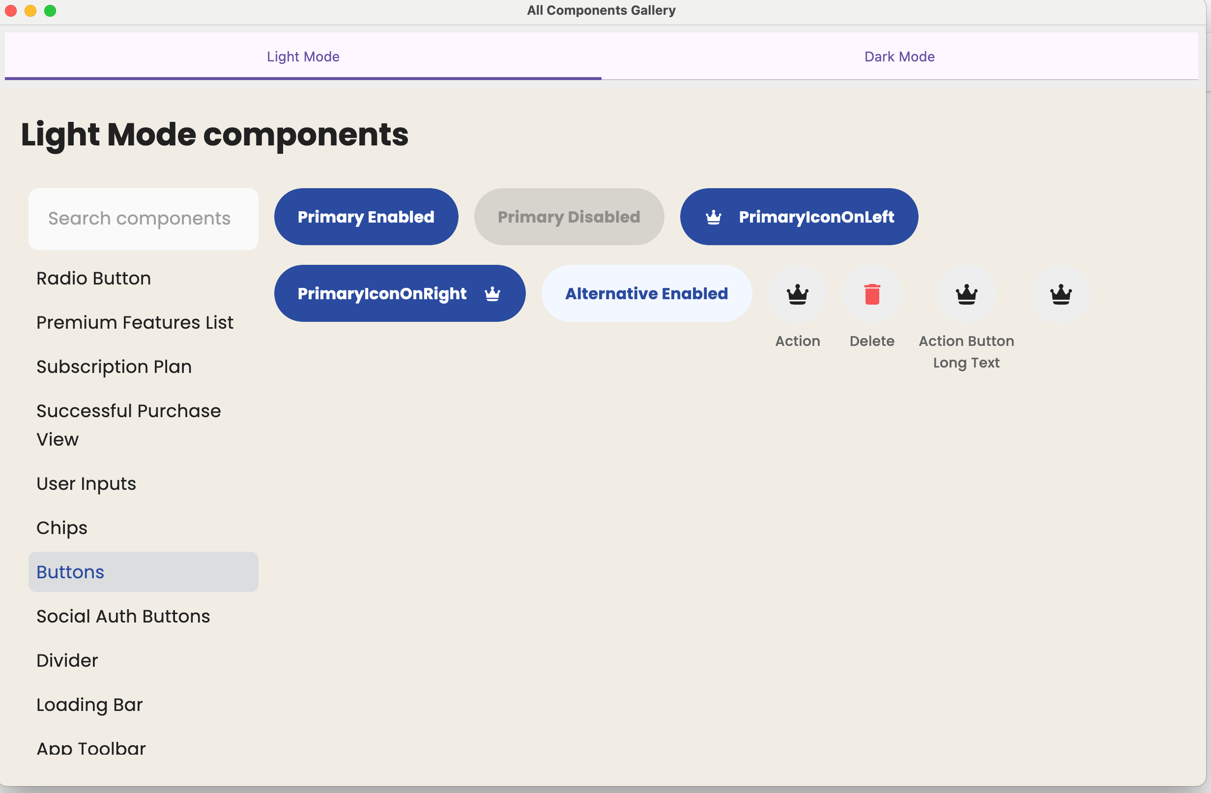
KMPStarterKit comes with already built in to use UI components. These components are located in designsystem module. Also Compose Hot Reload feature is enabled to iterate quickly. You can see all available components in AllComponentsGallery.kt file located in designsystem module. In designsystem/jvmMain there is Main.kt file. When you run it you can see and search all reusable components, also it supports hot reload, meaning if you change something in component you can see changes.
 .
.
Native Dialog
In Android it shows AlertDialog, and in ios it shows UIAlerts.
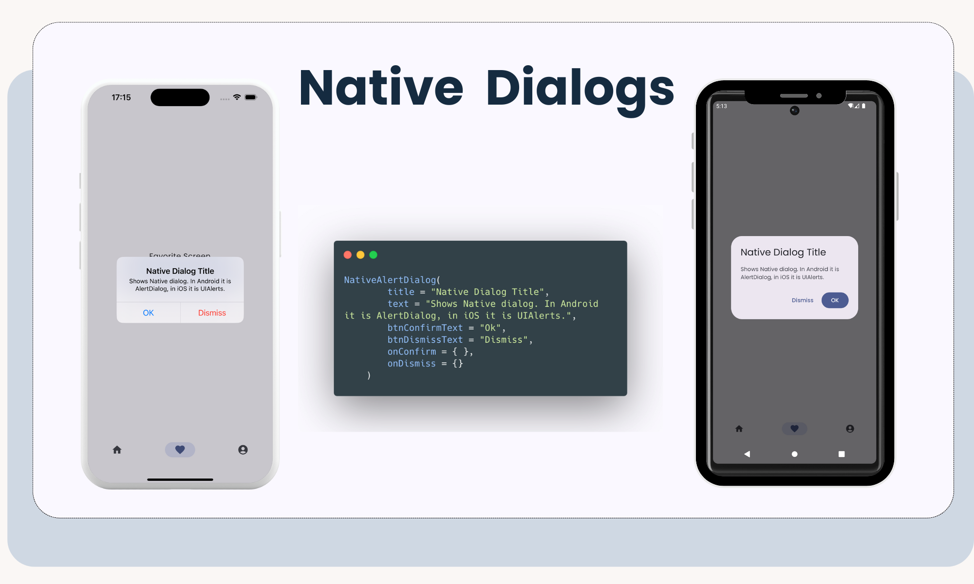
NativeAlertDialog(
    title = "Dialog Title",
    text = "Dialog body text",
    btnConfirmText = "Ok",
    btnDismissText = "Dismiss",
    onConfirm = {},
    onDismiss = {},
)
How to access resources
- For accessing resources in
designsystemmodule, such as icons, texts you can useUiRes.drawable.your_iconorUiRes.string.your_text. For accessing resources in app module instead ofUiResjust simply access withRes(ex:Res.drawable.your_icon. For simplicity you can even place all of your icons and string resources indesignsystemmodule. This will make very easy for you to support multiple languages.
Extra useful tip
If you are working on new UI component, you can replace AllComponentsGallery with your own component to quickly build that new UI component.
//designsystem/src/jvmMain/kotlin/Main.kt
fun main() {
    singleWindowApplication(title = "All Components Gallery", alwaysOnTop = true) {
        AllComponentsGallery() // <-- replace this with your own component if you want focus on one component
    }
}